Design ·
Building a brand our agents can follow
By Celeste Tsai
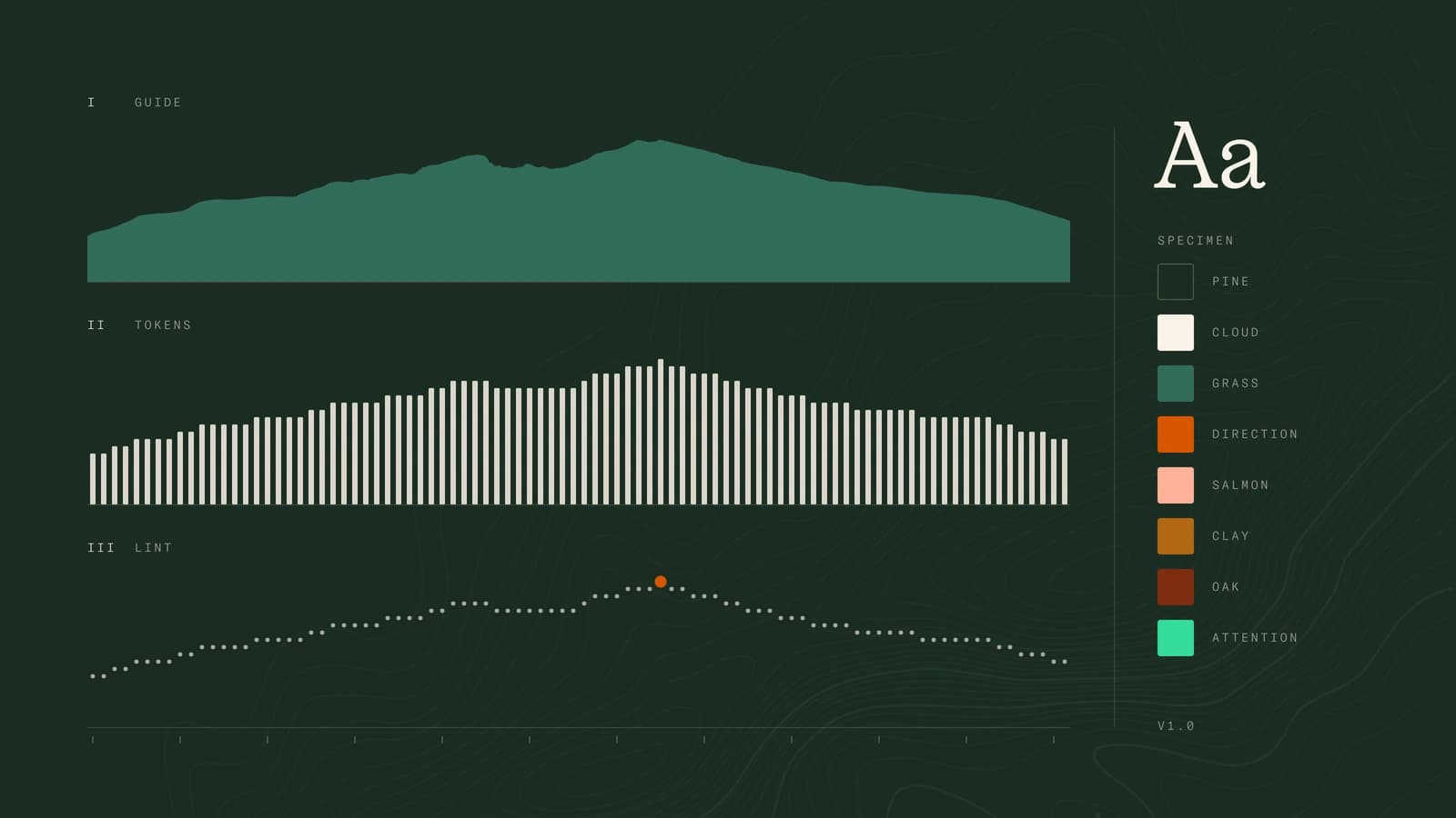
How we built sherpa's brand with a branding studio, and how it became a design system that both people and coding agents follow.
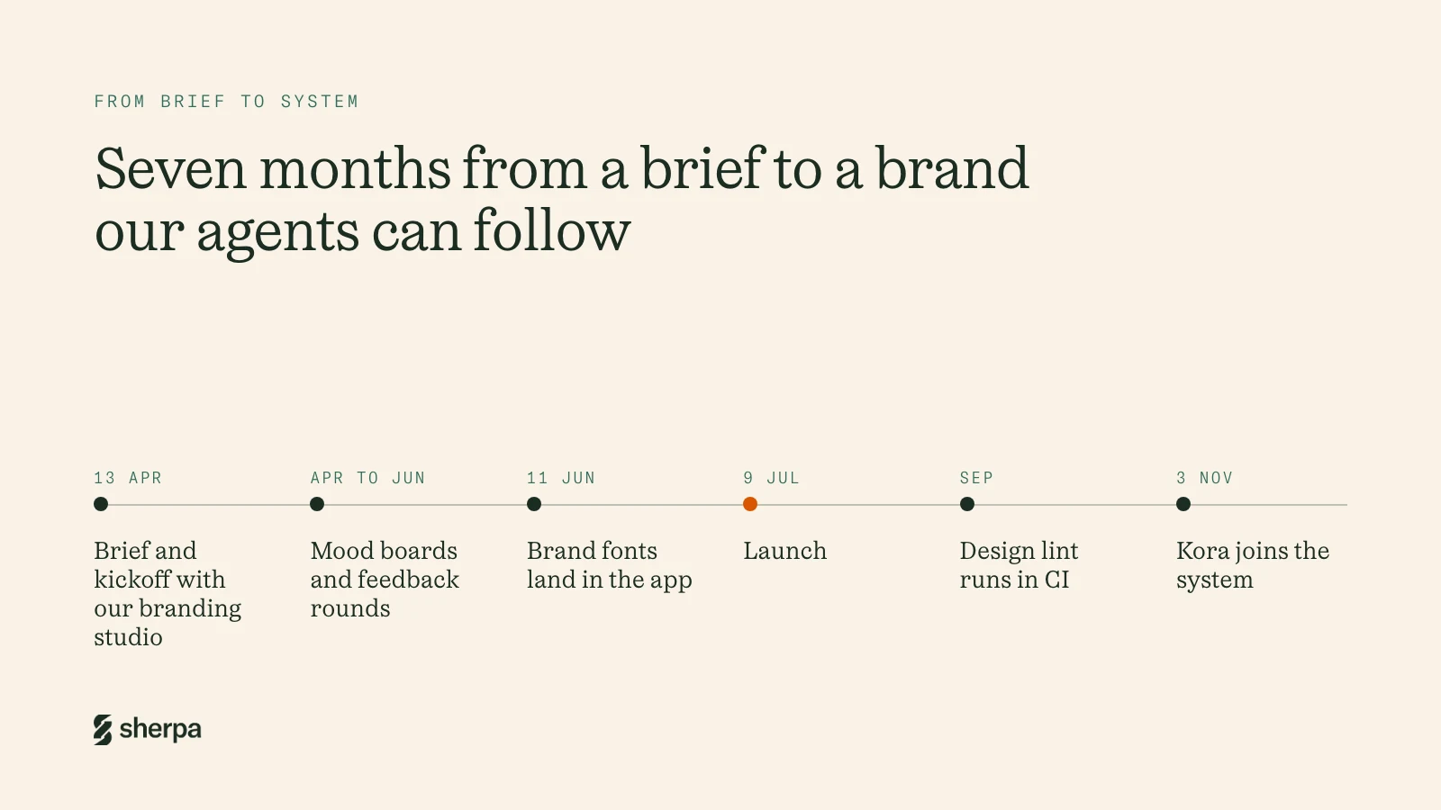
When I joined sherpa in April, the product already existed and the brand didn't. Screens were built straight in code from default components. Two days before our first onboarding call, Tristan had asked an agent to pull a design system out of what was there: Geist fonts, a warm teal and brown palette, a first DESIGN.md. It was a starting point, and we knew it.
The same week, we kicked off the brand with a branding studio. This post covers how that went, and what happened when the brand guide met a codebase where most of the UI is written by agents.
The brief: a mountain guide, not another AI company
Tristan's brief was short. A sherpa is a mountain guide. We're in Munich, at the foot of the Alps. So the brand should feel grounded, earthy and approachable: natural colours, a bit of grain, nothing that looks like it was cleaned with bleach. No neon gradients. Nothing that could be swapped for any other AI product.
There was a product reason too. Most people who open workforce software are business users who need it a few times a year. The tools they know were built by experts, for experts. We wanted the opposite feeling: you arrive, you know where to start, and someone is guiding you.
The studio's plan was mood boards in the first week, first designs by 1 May, two rounds of feedback, and a brand book by mid-June. Before their first session we made our own mood board, so we'd walk in agreeing with each other.
We also made one early call about order. Brand first, product system later. I've seen product design systems built before the product, and most of the components never get used. So we let the studio do the brand, and planned to grow the product system out of real screens.
Working with the studio
The studio came back with two directions. One leaned on paths, paper topographic maps and a bright orange. The other was warmer: summer evening tones, glassy surfaces, and a knot.
Round one was about direction. We picked the knot. A climber's knot says trust, and trust is most of what we sell. We asked to see it flipped so it also reads as an S. Then we asked for the rest to stay distinctly Alpine:
- Real peaks near Munich, like the Watzmann and the Zugspitze, instead of generic mountains.
- Fewer people in the imagery, and more of the paths and topographic maps from the first direction.
- The first direction's bright orange as an accent on top of the second direction's warmer palette.
Round two, in late May, was about the details.
- The mark felt slightly tilted at small sizes. Inside the team, the first instinct was to ask for a rounder logo. I suggested we frame it differently: keep the sharp, Alpine edges and fix the balance and the negative space, so the mark feels stable without going soft. The studio got a feeling to aim for, not a fix to copy.
- The topographic maps turned out to be American. The labels gave it away: creeks and valleys. We asked for European Alpine maps with Alpine place names, and that's what's in the guide now.
- The name went lowercase, and "AI" came out of the logo. A capital S never looked right, and "AI" in the name felt forced.
- Glass got a boundary. Expressive on the website and in marketing, flat in the product, with glass only on a few elements like the chat input. Done badly, glass looks like an old operating system. Done well, it looks premium.
- Colour. Keep orange as the accent, and explore how intense it should be. Move Salmon away from a muted, boiled-salmon tone towards orange. Find a stronger Attention Green, because the first one felt weak.
Looking back, the rounds worked because we kept them in order: direction first, details second. After that we mostly stayed out of the way while their graphic designer built it out, adding to the Figma file a little more every day through June.
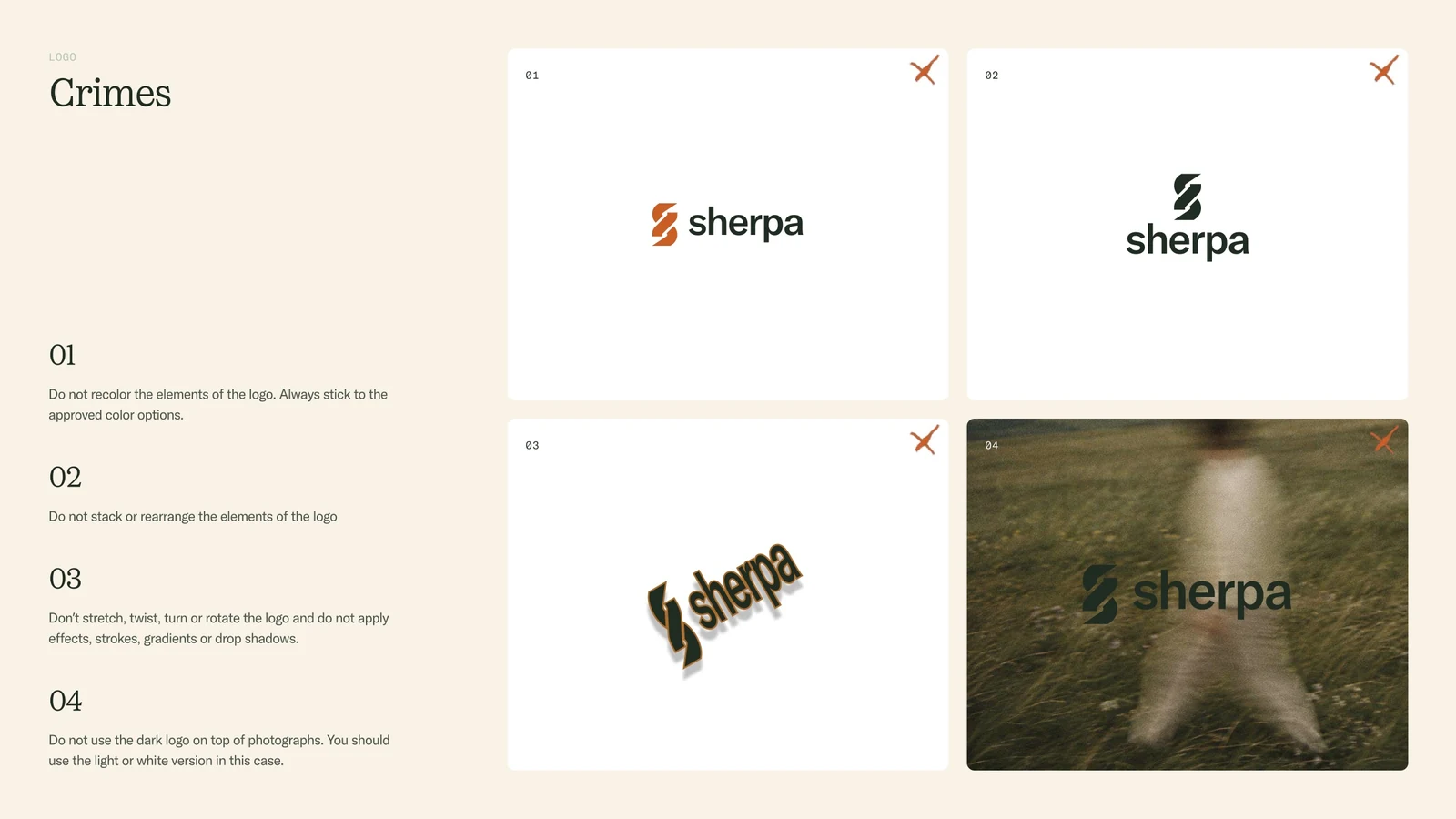
One part of the guide I'd recommend to anyone: the "crimes" pages. For each section, the guide shows what not to do. Don't recolour the logo. Don't put the dark logo on a photo. Don't use accent colours as backgrounds. Don't set the mono font in lowercase. A list of crimes turned out to be more useful day to day than any mood board, because it answers the question people actually ask: can I do this?
What the brand guide gave us
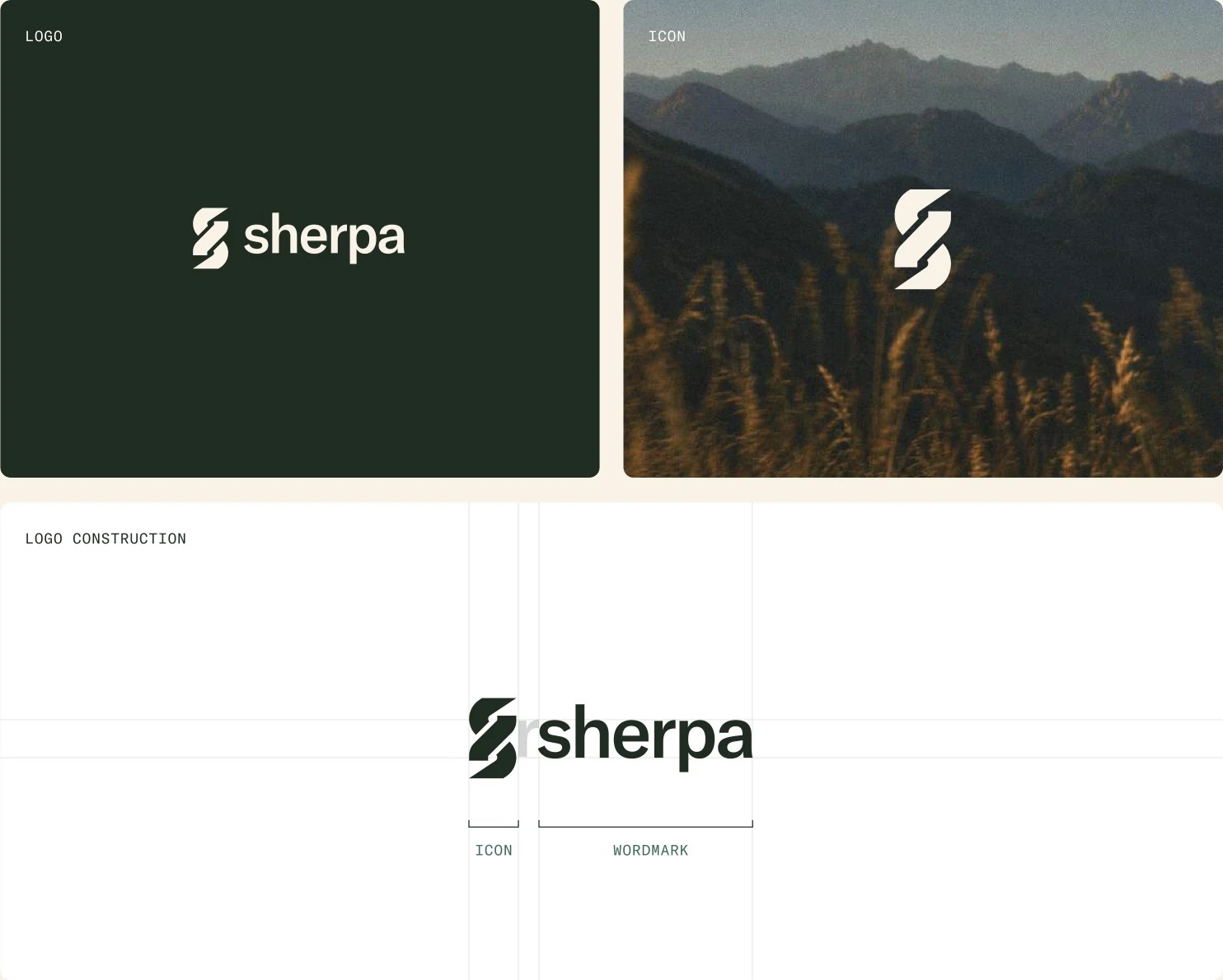
The mark. The symbol is a figure-eight knot, the climber's anchor for safe passage, drawn so it also reads as an S. The wordmark is set in lowercase to keep it approachable and direct. That's why we write sherpa in lowercase everywhere.
Colour. Pine, a deep forest green, and Cloud, a warm off-white, carry most surfaces. Direction orange is kept for the thing you should do next. Salmon, Clay, Oak, Grass and Attention Green support them. The guide gives a colour ratio, and says plainly that it's a reference, not a formula.

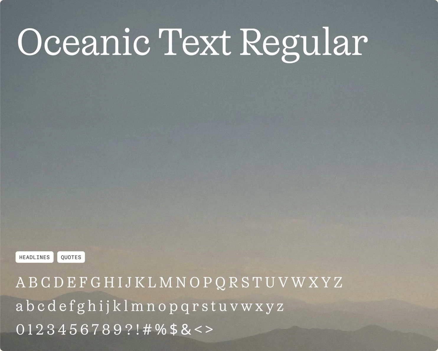
Type. Oceanic Text, a warm serif, for headlines and quotes. GT America for body text and buttons. GT America Mono, always in capitals, for labels.
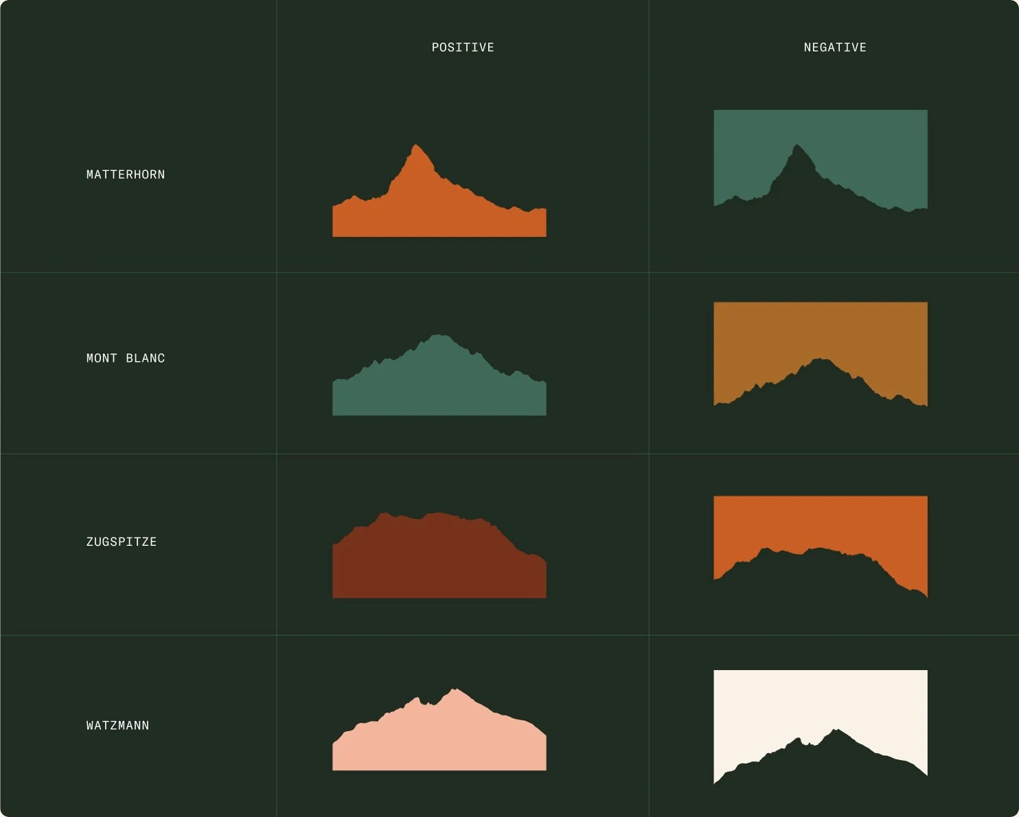
Graphic elements. Ridge silhouettes of real Alpine peaks (the Matterhorn, Mont Blanc, the Zugspitze and the Watzmann), topographic maps of the German Alps, and path lines.
Photography. A 35mm point-and-shoot film look: low contrast, real grain, figures blurred in motion while the landscape stays still. The guide includes a master prompt for generated images, so a photo we shoot and an image we generate are held to the same standard.
Product illustrations. Interfaces drawn in white glass at a few opacities, set against Pine or a photo, with the send button always in Direction orange.
From a brand guide to a file our agents read
On 11 June the fonts arrived. We added them to the system during our daily, and by the end of the call the app was rendering in Oceanic Text and GT America. Geist was gone. That was the moment the studio's work landed in the product.
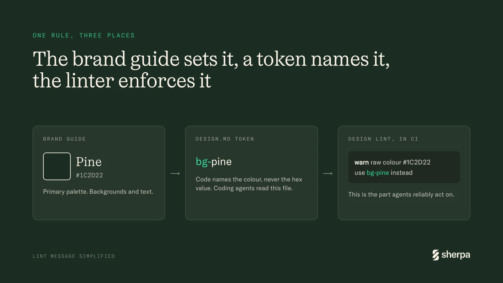
The palette became named tokens, so code says bg-pine or text-attention-green instead of a hex value. DESIGN.md became the single place for every visual decision: fonts, colour, spacing, tone of voice. The instructions file every coding agent reads at the start of a task points to it.
Then we hit the real problem. Most of our UI code is written by coding agents. They read DESIGN.md, but not consistently. What they reliably act on is lint output. So in September we added a design lint that runs in CI. When an agent uses a raw colour or an arbitrary font size, the linter says which token or size to use instead. The number of warnings is only allowed to go down.
Salmon is a good example of the system tightening over time. It kept turning up as a third button colour. It's also hard to read as text on white. So DESIGN.md now gives Salmon two jobs, annotations and category tags, and nothing else.
The brand guide is still the source. The difference is that its rules now live where the builders are, and most of those builders are agents.
A system you can extend
The test of a design system is the first time you need something new. For us that was Kora, the agent inside sherpa. Kora didn't get a new brand. It got one mark, a few motion states and one orange accent, inside the same type, colours and assets. Orange already meant "the agent is involved" before Kora had a name. The whole extension took about a week. See Naming our agent, and giving it a face.
What we'd keep
On launch day in July, Tristan said something I didn't expect. Beyond how it looks to customers and investors (one told him it didn't look like any other AI product), the brand had become something the team holds together. People point at it and say: that's us.
I'd add three things for anyone doing this at a small company:
- Do the brand first, and grow the product system out of real screens.
- Ask your studio for crimes, not only rules.
- Write the rules down where your builders will read them, and if your builders are agents, put them in the linter.
Share this post
Share on LinkedInBuild the future of work with us.
Whether you want early access or you’re curious about joining the team, we’d love to hear from you.